
Rijksstudio: Make Your Own Masterpiece!
Peter Gorgels, The Netherlands
Abstract
In anticipation of its reopening on April 13, 2013, the Rijksmuseum in Amsterdam launched Rijksstudio, the new online presentation of 125,000 works in the collection. Rijksstudio invites members of the public to create their own masterpieces by downloading images of artworks or details of artworks in the collection and using them in a creative way. The ultra high-resolution images of works, both famous and less well-known, can be freely downloaded, zoomed in on, shared, added to personal ‘studios’, or manipulated copyright-free. Users can have prints made of entire works of art or details from them. Other suggestions for the use of images include creating material to upholster furniture or wallpaper, or to decorate a car or an iPad cover for example. To celebrate this digital milestone, the Rijksmuseum asked leading international artists, designers and architects to become pioneers of Rijksstudio by selecting one work from the collection and using it creatively to create a new artwork. The museum has launched a parallel campaign with a physical pop-up Rijksstudio. The campaign kicked off at the De Bijenkorf department store in major cities nationwide. A dedicated team assisted visitors in making creative products using online tools and on-site equipment such as textile printers and laser cutters.
Rijksstudio will help anchor the Rijksmuseum’s position in the new world of digital image culture and open design.
Keywords: collections; image culture; user generated content; responsive design; deep zoom technology; online / offline campaign
1. Introduction
The main building of the Rijksmuseum will reopen on April 13, 2013, following a major renovation. In anticipation of this important event, a new website was launched on October 30, 2012. It includes a remarkable new concept: the Rijksstudio (https://www.rijksmuseum.nl/rijksstudio).
Rijksstudio is an innovative digital application that makes a large part of the museum’s collection available to all, absolutely free of charge. Some 125,000 well- and lesser-known pictures can be examined in close detail. Users can interact with them, “like” them, share them with others and use them in any way they wish.

Figure 1: Tattoo by Droog, based on the 17th century painting Still Life with Flowers by Jan Davidsz. de Heem
Rijksstudio is a unique project by virtue of the quality of images, interaction with the public, and concept of “closeness” forming the guiding principle of Rijksstudio, which is borne out at various levels. In practice, this entails:
- A focus on the image. Many museum websites present a wealth of information and “data.” Rijksstudio believes in the strength of the images themselves, which are used to create an engaging online aesthetic experience.
- High-resolution images (2500 x 2500 pixels, 300 dpi) which are of real value to the user. The Rijksmuseum now allows free use of 125,000 high-quality digital reproductions, with absolutely no limitations. These are not “thumbnails,” and there are no watermarks or sharing restrictions.
- Rijksstudio invites the public to enjoy and explore the images: zoom in, save, manipulate, and share. Users are encouraged to download the images and to do something—anything you like—with them. The Rijksmuseum is “democratizing” its collection. As Taco Dibbits, the director of Collections, said at the launch of Rijksstudio, “We believe in the strength of our masterpieces. We also believe that they belong to everyone, and that there is an artist in all of us”.
- An “ambassador campaign” has been launched to promote Rijksstudio. Well-known artists were asked to produce a work inspired by the Rijksmuseum’s collection. A real-world pop-up Rijksstudio visits locations such as the De Bijenkorf department store, where visitors are invited to produce their own artwork.
- The new Rijksmuseum website and Rijksstudio have been developed according to the principles of an app. The priority is ease of use and control, whereby all tasks can be undertaken with a minimum of user interaction. Touchscreen control, inspired by iPad apps such as Guardian Eyewitness, in which the full-screen image is not obscured by information or function buttons, is new to the museum world. The website is also fully responsive: it works well on (almost) all devices.
The new website and Rijksstudio have exceeded all expectations, generating a very positive response.
In this article, we examine in further detail the various aspects of Rijksstudio, from strategy within contemporary image culture to the concept and the design of the campaign. We conclude with a brief consideration of the concept of the “aura”: does an artwork gain or lose by being digitally reproduced, and is there such as thing as a “virtual aura”?
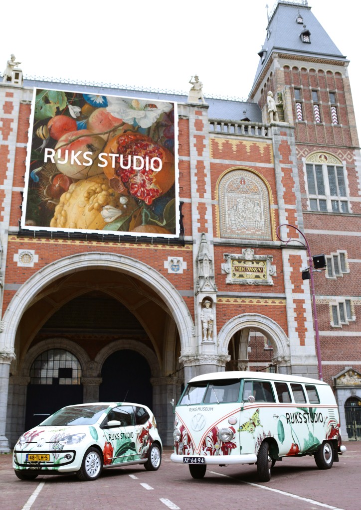
Figure 2: Rijksstudio at the Rijksmuseum
2. The situation at the time of the project launch
The digital (museum) landscape: trends and developments
What was the “digital landscape” in late 2011, when the Rijksmuseum began to develop its new website and Rijksstudio?
Online collections
Many museums and archives have digitized large parts of their collections. The result is a large number of extensive online presentations and various types of “web specials.” Although content-rich, the design of the “virtual museum” often fails to rise above the level of a database intended more for administrative purposes than for aesthetic pleasure. The artworks are often shown as small thumbnails. If they can indeed be enlarged, there are various (technical) restrictions which stand in the way of a truly user-friendly experience. Web specials on museum sites often attempt to reach a wider audience by including custom-made content in some unconventional presentation form. In many cases, these specials cover only a very small part of the overall collection. Some use technologies such as Adobe Flash, which can hardly be described as “future proof” since an increasing number of devices no longer support it, including the phenomenally popular iOS devices from Apple.
Apps and websites
The online landscape has changed significantly in recent years. The Internet is now dominated by several large sites, each with a specific purpose: Google for information, Facebook and Twitter for social interaction, Wikipedia for knowledge, and YouTube for video. Many users restrict themselves to specific sites for specific tasks. These platforms have functionalities and application programming interfaces (APIs) available to other sites.
The way in which we use computers has also changed greatly since the introduction of the iPhone and, more recently, the iPad. Previously, the device itself determined our online behavior. The user would go to his desktop computer, wherever that happened to be installed, and may eventually have chanced upon the Rijksmuseum website. Today, online behavior is more targeted: the determining factor is the task or activity itself. If users wish to look something up on the Rijksmuseum website,they will use whatever device is on hand depending on where they are at the time: the smartphone when out and about, the tablet when relaxing on the couch, the laptop at the kitchen table, or the desktop computer at work. They expect an optimal website experience regardless of the choice of device.
The success of “apps” has also changed online behavior. Apps are designed for ease of use. Many offer only one or two services, but those services are both useful and relevant. While websites are increasingly becoming repositories of content and functionalities, some more useful and some less so, apps excel in offering precisely what is needed and no more. Only if a large number of users complain that an app lacks a certain feature will it be incorporated into the next update. Focus on what is important, publish, and then assess what works and what does not. App development is an ongoing user survey!
Compared to apps, a major advantage of websites is that they and their content can be readily found. Moreover, several smartphone apps are used more regularly than others: Twitter, Facebook, and news services, for example. These apps often link to websites, whereby it is important that the website itself be fully responsive (Cashmore, 2012).
The iPad was introduced just over two years ago. The tablet format has many advantages, one of the most notable being the intimacy between user and content. The content is literally within hand’s reach, but it is also “large” enough to be enjoyed to the full. The tablet sits in the living room like some much-loved pet. Every now and then it is picked up and tenderly caressed. No other device offers such a warm relationship between user and content.

Figure 3: Responsive design
A sea of images
The tablet is an extremely suitable medium for organizations that offer visual content. Apps such as Flipboard (which presents social media sites in the style of a glossy magazine) and The Guardian Eyewitness (a remarkable news photo every day) make optimum use of the tablet format. Eyewitness allows the user to “swipe” through a selection of images, all shown fullscreen, to zoom in and manipulate them by touching the screen. A subtle movement with the finger reveals brief information about the image; to access full information requires the press of a button. Interaction with the original image is paramount.
Today’s online world has a plethora of images. People and organizations publish their photos on websites such as Facebook and Flickr, or using apps such as Instagram and Twitter. We are at risk of being overwhelmed by the sheer number of images. One online service that has responded well to the volume of images available online is Pinterest. It is a user community that allows you to present your own collection of favorite and remarkable images, from a variety of sources. You can “follow” other users in order to enjoy their visual finds. Visual bookmarking has never been so attractive, and Pinterest has proven a great success (Ekaterina, 2012). This is the area in which the new target group of “culture snackers” is active. The culture snacker is the digital counterpart of the culture tourist (we shall return to them later).
Open content and design
Another interesting development is “open content” (Anderson, 2009). Because it is now possible to distribute content easily, the communis opinio is that it should be distributed to all, provided no intellectual rights are infringed. The Creative Commons movement has played a major role in cultivating this public opinion. Although museums and archives possess a very large quantity of rights-free material, relatively few have attempted to make it widely available as yet (some good examples are the Metropolitan Museum of Art in New York, and the National Gallery of Art and the Library of Congress in Washington, DC).
Parallel to the emergence of open content is that of “open design.” Images are not only found, collected, and published: they are also manipulated. Users alter images to humorous effect or to produce their own artwork, which they then share with the outside world. In recent years, this practice has been given greater depth by the open design movement. New technologies and devices such as laser cutters, textile printers, and 3D printers have made it even easier to make products in a medialab or even at home (Anderson, 2012).
Google Art Project
Last but not least, Google has thrown a pebble into the pond of the museum world with its Google Art Project. By deliberately opting to display large images in high resolution, Google has gone further than many individual museums or partnerships have previously dared. The Google Art Project can be called an eye-opener in more ways than one.
The former Rijksmuseum website
The former Rijksmuseum website went online in 2004. In many ways, it was a relic of the times before the developments described above. The site included an online collection with small format images, an educational database, and hundreds of Flash web specials spread over the various site sections. Information was fragmented; users were given too many options with no clear navigation hierarchy. The entire “look and feel” of the site was complex and cumbersome.
This website created distance between the museum, its collection, and the public. Reducing this distance is one of the key challenges to which a large, heterogeneous institution such as the Rijksmuseum must rise.
The closure of the main building for renovation provided an opportunity to digitize much of the collection. The Rijksmuseum believes that it has a duty to present online the artworks that will be not on view in the new Rijksmuseum (approximately 8,000 out of a total of 1.1 million objects will be on display). They should be made available to all.
3. Principles
At the start of the project, we formulated a number of basic principles.
Mission and core values
The mission of the Rijksmuseum is to connect people, art, and history. In 2011, the museum adopted a new “tagline”: Rijksmuseum, the Museum of the Netherlands. It also formulated a number of core values: simplicity, personal, authenticity, quality, and innovation.
E-strategy – bring the collection to the public
Based on the mission and core values, the Rijksmuseum then devised its e-strategy. Further to the mission itself, the main objective of our online presence is to bring the collection closer to the public.
To maximize the outreach of our content, we then developed the model described below, which is a variant of the Forrester Research “Earned, owned and paid media” model (Corcoran, 2009).
We distinguish among three types of media:
- Our own domains (e.g., the website)
- Our presence elsewhere on the Internet (e.g., Facebook and Twitter pages, Wikipedia entries)
- “Earned media” (e.g., where someone includes Vermeer’s The Milkmaid on their own blog)
Our efforts are primarily concerned with the first two categories: our own domains and our presence elsewhere; however, we also wish to encourage people to publish our content on their own sites and blogs. The more who do so, the greater our outreach. We must earn this attention by offering attractive content that is easy to share. The overall objective is to ensure that Rijksmuseum enjoys an extremely high online profile, which can best be achieved by sharing beyond our own domains.
These considerations gave rise to a number of strategic principles:
- The website must be “lean and mean”, like an app.
- It must be possible to share all content easily (e.g., by means of open APIs and a prominent Share button).
- The website must be an open platform.
- Other platforms should be used where possible rather than building everything ourselves.
- The website should reflect successful trends. Rather than thinking solely in terms of the collection, we must identify ways of reaching the public.
- It must be possible to manage and present content regardless of device or screen resolution.
- It must be possible to find information quickly and easily.
- The website should “surprise and seduce,” whereby users learn more and will wish to return.
A new target group: the “culture snacker”
Rijksstudio’s main target group is the “culture snacker,” followed by the traditional target groups of art enthusiasts and professionals.
The culture snacker represents a new target group for the Rijksmuseum. As noted above, we now live in an image-heavy culture. We are bombarded with images every day, as people publish their photos on social media, often directly from smartphones. Creative manipulation of images has become commonplace, both for humorous and aesthetic ends. This is the new setting in which the culture snacker is active. He (or she) enjoys viewing images and sharing them with friends and followers. We think that everybody is (in a way) a culture snacker today and that it’s important for museums to reach them.
The Rijksmuseum believes in the strength of the works in its collection. Why else would we have lovingly conserved them for centuries? Through Rijksstudio, the museum wishes to give the collection a place within today’s image culture. We shall do so by mobilizing the culture snacker.
We have designed the website for a broad public comprising both culture snackers and dedicated art connoisseurs. We shall invite and seduce the snackers. We shall inspire and engage the art lovers, enabling all to take their passion further. Ideally, we shall convert the snackers into true art lovers, and we shall connect with all site users to create mutual loyalty.
4. Concept development
Having established the basic principles, we then began the concept development phase. First, our new housestyle was translated into a web design.
New housestyle and web design
The Rijksmuseum’s new core values are embodied in the housestyle designed by Irma Boom. She sees the visual identity of the museum as simple and, above all, clear. To reflect this, she created a new sans-serif typeface, “Rijksmuseum” (figure 4). To emphasize the authentic Dutch character of the museum, it includes a special “long IJ”, a letter which occurs only in the Dutch alphabet. In print, we usually have to combine an “i” and a “j” which is orthographically incorrect.

Figure 4: New Rijksmuseum logo
The clear and robust contemporary housestyle also formed the basis of the Rijksstudio website. Here, it offers an excellent starting point from which to create an accessible, assured site, reflecting the core value of simplicity (as well as authenticity and quality) in both content and user interface.
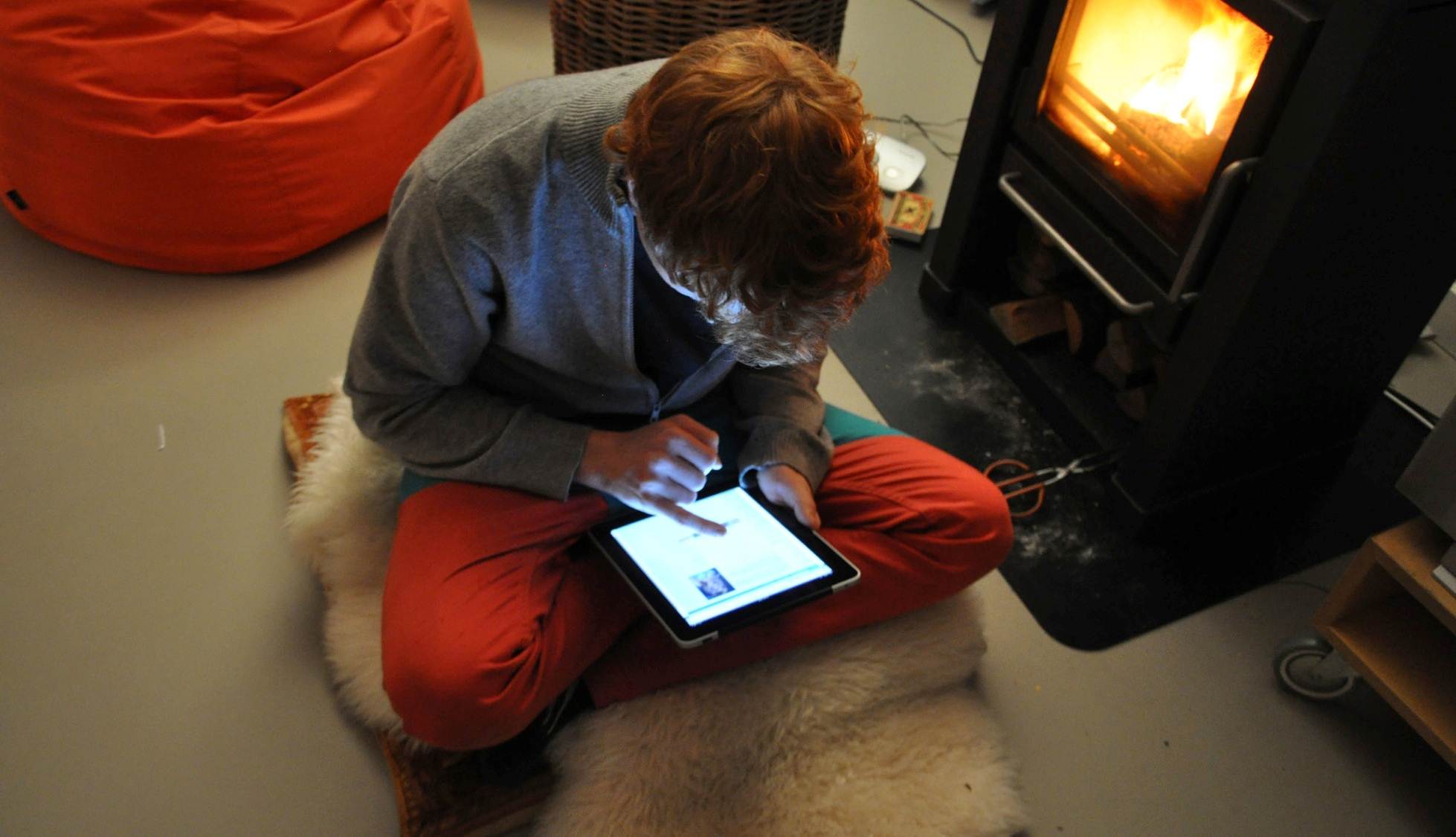
Figure 5: iPad: a warm relationship between user and content
Tablet first
The core value of simplicity also prompted the early decision to adopt a “tablet first” strategy. This has helped us to create a challenging and future-proof design, as robust as the new housestyle itself with large buttons specially for touchscreen control. This offers a totally different experience to a website controlled using keyboard and mouse. It fosters simplicity, whereby the website is more of an interactive app than a mere “repository of information.” The site works well on a PC, laptop, or smartphone, but our focus was always the tablet. The core values of innovation and interaction are paramount and are clearly reflected in the overall design, with its thumb-sized buttons and broad navigation bars.
The “perfect presentation”
A crucial moment in the concept development was a comment made by Taco Dibbits, the museum’s director of Collections. After design consultancy Fabrique had presented its initial proposal, Taco asked to see one of the slides again. It had probably been included only as a decorative filler. It was a striking fullscreen detail of a much larger painting. “Look at that,” exclaimed Taco. “Isn’t that absolutely marvelous? For me, this is the ideal way to view an artwork; the picture in its full glory, uncluttered by information or buttons.” This concept came to dominate the entire development process: we opted to focus on the essential content. Anything else should be pushed into the background or omitted altogether.
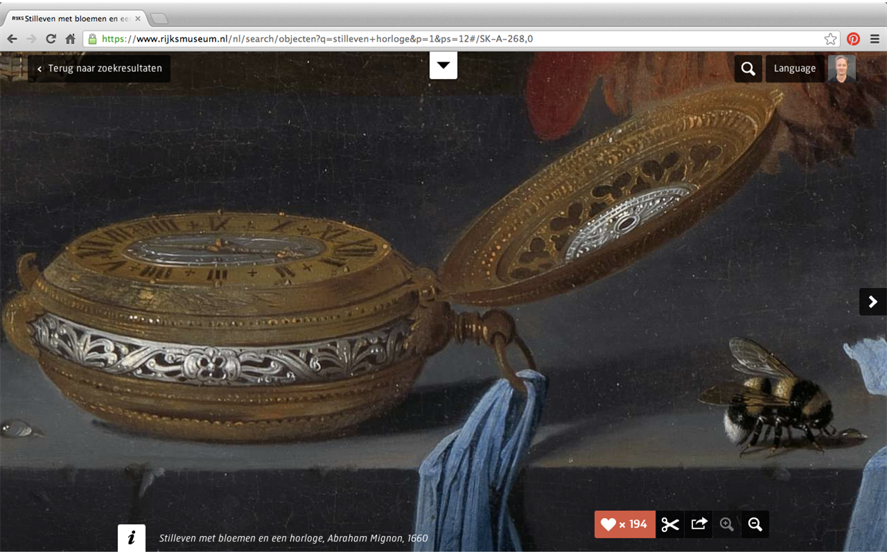
Figure 6: A “perfect presentation”
Close to
Over time, our “close to” concept began to take shape. Closeness became the core value of the new website, which is interpreted at various levels:
- Close to the website visitor.
- Close to the collection.
- Close to the building (a real world visit).
- Museum experts are close at hand.
- We bring everything close by, so that the user can reach out, establish personal contact, and zoom in and out. We make art accessible, inviting, and inspiring. We encourage touching. We create ease of use.

Figure 7: Close to the art
5. Rijksstudio: Make your own Masterpiece
The website comprises two sections that overlap to a degree:
- A museum section, supporting a real-world visit
- Rijksstudio, the collection, and social interaction
Both sections rely heavily on images. In the museum section, those images relate to the collection, the building, and its connection with the visitor. In the Rijksstudio section, the images relate to artwork with which you can interact, and which you can use in any manner you wish. Information, especially detailed information, is of secondary importance. Rijksstudio is an application with a distinctive profile and positioning; it is the Rijksmuseum’s slightly impish little brother.
In fact, the online collection can be enjoyed without entering the Rijksstudio section. Users can use the “Discover the collection” and “Search the collection” tabs, which appear on all pages. In developing Rijksstudio, we therefore opted to incorporate innovative options, safe in the knowledge that they would not deter the more traditional art enthusiast.
Initially, we considered giving Rijksstudio its own separate website. Eventually, we opted to integrate Rijksstudio into the main Rijksmuseum site, where it would form a social layer above the online collection itself. We applied the 80/20 rule: we designed on the assumption that 80 percent of visitors would represent the identified target groups. At the same time, the other 20 percent must also be able to find their way around. The result is simplicity.
Content was added according to the same principles. As a blog by Fabrique (Stork, 2012) notes: “The information is provided in layers. There are few options at the top level, but they cover all the main user requirements. The home page is not a portal with hundreds of links, but serves to bring the museum and collection closer to the user by allowing plenty of space for images.”
Rijksstudio opens up our museum to the world and makes the entire collection immediately accessible to everyone, regardless of location. It does so in several ways, as described below.
Please touch!
All 125,000 artworks in the online collection can be viewed full screen, and users can zoom in to examine them in the smallest detail (often in more detail than offered by the Google Art Project). We deliberately opted not to resize the full-scale images to fit the user’s screen. This means that the user will not necessarily see the entire painting at first, as is usual on most museum websites. To do so requires zooming out, a very simple procedure; however, the content management system allows us to select the best starting point for both horizontal and vertical screen resolutions: the initial on-screen image will be an interesting detail rather than a uniform section of the background.
Users can “swipe” through a personalized selection of artworks (e.g., those found using the search engine), and this offers a rewarding visual experience. In Rijksstudio, the visual experience is the key aspect; providing information is of secondary importance.
Both culture snackers and serious art lovers will find an attractive selection of artworks in the “Discover the Collection” section of the main site. The operative word is “selection”: we have deliberately opted not to present the a complete image library, but only the highlights that will introduce art and art history to a broad public. Much of the “encyclopedic” information included on the former Rijksmuseum site can today be found elsewhere, on sites such as Wikipedia. It is our e-strategy that we only publish ourselves what has real added value. For example, we no longer explain who the biblical Moses was, as we did before, since this information is readily available from a host of sources even more authoritative on the subject than the Rijksmuseum.
Art connoisseurs and professionals can use the “Search the collection” function to find one or more specific works. Search results can be refined, and it is even possible to search by predominant color. Online visitors can also “tag” the artworks for the benefit of others.
A lot of pages of the site includes a set of artworks (for example,
https://www.rijksmuseum.nl/en/general-information/address-and-route), allowing
users to scroll horizontally, vertically, or diagonally through the full-screen
images of the collection.

Figure 8: Select and save a detail
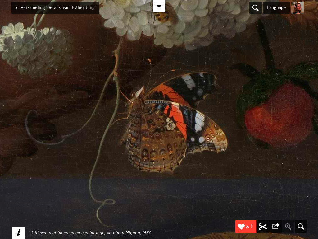
Figure 9: Even the smallest detail
Saving
Based on their own special interests, site users can create personal collections, saving either complete images or interesting details. This function is broadly similar to Pinterest.
The “MasterMatcher” game allows users to enter simple criteria (such as their favorite color), whereupon they will be shown matches that allow them to start building their own personal collection. Having entered a few simple personal preferences, users are shown a selection of objects representing all categories of the museum’s collection. Masterpieces by Rembrandt might jostle alongside 18th-century furniture and 20th-century documentary photographs. The “long tail” of the collection then comes to life, and the user is able to enjoy the full breadth of what the Rijksmuseum has to offer. This will create inspiring cross-connections that may well appeal to a different, wider public.

Figure 10: Build your own collection in Pinterest style
Creativity
Users are encouraged to use the images they find in any way they wish. They might for example select part of any of the 125,000 copyright-free images to use as a greeting card or poster, or to have printed on canvas, aluminum, or plexiglass as a home decoration. A special cropping tool has been developed to help users select part of an image. Orders for special products are processed by the Dutch start-up company Peecho, which has installed an API on the site linking to various print-on-demand companies.

Figure 11: Make a printout of (a detail of) your favorite work of art
It is also simple to download a high-resolution .jpg file for home use. The possibilities are endless: knitting patterns, t-shirts, a tablecloth, a customized vehicle, or even objects made with a laser cutter or 3D printer. Rijksstudio is exceptional in that we actively encourage users to be creative in this way. This is not just another peripheral user option, but the very crux of the Rijksstudio concept.
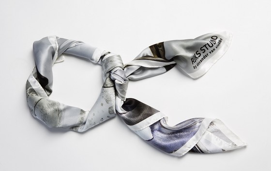
Figure 12: Silk scarf by Alexander van Slobbe, based on the Rijksmuseum collection
Sharing
All work displayed or created online can be shared via social media. Large and conspicuous buttons invite the user to do so.
Responsive, app-style design
The design of the website brings the museum close by. It is as easy to use as an app, and it is responsive: it works on all devices, whether a smartphone, tablet, or large desktop monitor. The site really comes into its own when using an iPad. Site statistics show that iPad users visit the site particularly frequently and spend a considerable amount of time exploring the site.
Campaign
To bring the online Rijksstudio to public attention, we joined the advertising agency Skipintro in devising a real-world version: a pop-up studio which can be taken virtually anywhere. It has already proven a great success in the Amsterdam and Eindhoven branches of the Netherlands’ famous department store, De Bijenkorf. Here, our team helped visitors to express their creativity with online tools and equipment such as textile printers and laser cutters.

Figure 13: From shirts to tableware, and from wallpaper to scooters, anything is possible using Rijksstudio
Renowned designers and artists were asked to produce new artworks inspired by the Rijksmuseum collection. Fashion designer Alexander van Slobbe produced a dress and shawl two-piece, which De Bijenkorf sold in a limited edition of 100. Rachel Harding of Studio Droog designed a remarkable tattoo based on a still life by the 17th-century painter Jan Davidszoon de Heem. Christian Borstlap produced a stunning video animation in which he brings to life various prints from the collection (https://www.rijksmuseum.nl/en/rijksstudio-inspiration).
The website and campaign were launched at a special event held in the new atrium of the Rijksmuseum, attended by Prince Constantijn of the Netherlands. An expert panel discussed the role of digital art collections in today’s era of online imagery and limitless reproduction (http://www.wallpaper.com/art/digital-innovation-think-tank-at-the-rijksmuseum-amsterdam/6148).
Method
“Closeness” was also a key concept of the chosen development methodology, “Scrum.” Scrum is an iterative and incremental agile software development framework for managing software projects and product or application development (Wikipedia). In short, it involves multidisciplinary teams working in short sprints (of between one and four weeks) to produce functional software. The concept relies on cooperation, communication, and team spirit. The name “Scrum” is taken from the sport of rugby, in which the scrum is a group of players who engage with the opposing team in order to gain possession of the ball. A key feature of the Scrum development method is that phases can overlap. It is not necessary for one phase to be completed before the next begins.
Close cooperation among Rijksmuseum staff, designers, and developers ensured the best possible result. We worked with a “long list” of wishes and ideas that helped us identify priorities and tasks. The method also helped to ensure the app-like character of the website, since we were constantly required to focus on what would achieve the greatest added value.
Because working functionality was delivered every two weeks, we could quickly familiarize ourselves with how the finished product would operate. Interim results also influenced the choices made on the basis of the long list, whereupon we could introduce new ideas. The intensive process therefore worked towards the desired result in a very structured manner.
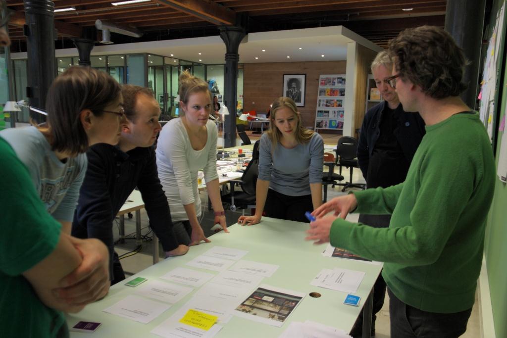
Figure 14: In the scrum room
Technology
In order to display 125,000 images (totaling 690 gigabytes) at zoom level, our technical partner Q42 first installed a work queue. Images were taken from the Mediabin image library and automatically cropped based on earlier low resolution images. They were then “tiled” to various zoom levels and uploaded to the Google App Engine in the “cloud.” At the front end, the open source application Leaflet is used to display the images and facilitate the zooming function.
6. Results
The results of Rijksstudio have far exceeded our expectations. The entire concept has been very well received at home and abroad. The idea of literally giving away high-quality images, supported by creative ambassadors and a state-of-the-art website that is extremely intuitive in use, has been described as “revolutionary.”
In the first three months alone, over 32,000 Rijksstudio portfolios were created, more than 112,000 artworks from the Rijksmuseum’s collection were downloaded, and 28,000 sets were made. The amount of visitors has grown 34 percent since the launch of the new version of the website. The duration of each visit has increased from an average of 3 minutes to 10 minutes, and iPad users especially spend a significant amount of time exploring the site (19 minutes!). The number of visitors using iPads or other mobile devices has also risen by 90 percent.
It is gratifying to see so many personal sets being assembled, the diversity of which is remarkable. Some visitors opt to save “favorites” seemingly at random, while others work to a theme: children, houses, cityscapes, clothing, colors, or professions, for example. Some site visitors have been particularly creative: there is one collection entitled “Bottom Lefts,” in which user Mark Creegan has collected only the bottom left corner of various paintings, which he has then assembled to form an interesting “abstract” artwork (figure 14).
The only aspect that has not been in line with expectations is the number of orders for products. Perhaps users find the ordering process too complex, or are not yet satisfied with their own creative efforts.

Figure 15: Mark Creegan collected only the bottom left corner of various paintings
7. Aura, no aura, or a virtual aura?
Every now and then, the debate about the true perception of an artwork—its “aura,” to use Walter Benjamin’s term—is rekindled (Benjamin, 1968). This was the case following the launch of the Google Art Project in 2011, and again when Rijksstudio went online. Why go to a museum if you can enjoy the same artworks at your leisure on the nearest computer monitor?
The Rijksmuseum firmly believes that interest in visiting a real-world museum will not decline even if the works can be seen in all their detail elsewhere. In fact, online viewing will serve as a “marketing instrument,” inspiring people to enjoy the works at first hand. And the huge number of reproductions of a painting such as Vermeer’s The Milkmaid actually enhance its aura.
In Rijksstudio, users can interact directly with the artworks, which then take on a new significance. Susan Hazan (2001) terms this a “virtual aura”: “We recognize the inextricable link between art and culture, yet we are awed by what we do not fully understand. When we are able to step back and maintain critical distance from these experiences and appreciate the craftsmanship of the new medium, we might even be able to discern the patina of human endeavor and regain in some way the lost aura; the virtual aura.”
At the Rijksmuseum, we believe that this virtual aura will enhance the aura of the original artwork, not detract from it.
8. Acknowledgements
Rijksstudio was made possible by the BankGiro Lottery (https://www.rijksmuseum.nl/en/join-us/funds/bankgiro-lottery).
9. References
Anderson, C. (2009). Free: The future of a radical price. Hyperion.
Anderson, C. (2012). Makers: The new industrial revolution. Crown Business.
Benjamin, W. (1968). “The work of art in the age of mechanical reproduction.” In Illuminations, Hannah Arendt (ed.). London: Fontana, 214–218.
Cashmore, P. (2012). “Why 2013 is the year of responsive web design.” Mashable. December 11, 2012. Consulted: http://mashable.com/2012/12/11/responsive-web-design/
Corcoran, S. (2009). “Defining earned, owned and paid media.” Forrester: Sean Corcoran’s Blog. December 16, 2009. Consulted: http://blogs.forrester.com/interactive_marketing/2009/12/defining-earned-owned-and-paid-media.html
Ekaterina, W. (2012). “The rise of visual social media.” Fast Company. August 28, 2012. Consulted: http://www.fastcompany.com/3000794/rise-visual-social-media
Hazan, S. (2001). “The virtual Aura – Is there space for enchantment in a technological world?” Museums and the Web 2001. Toronto, Ontario: Archives & Museum Informatics. Consulted: http://www.museumsandtheweb.com/mw2001/papers/hazan/hazan.html
Stork, P. (2012). “Dicht bij het museum.” Fabrique. Consulted: http://www.fabrique.nl/case/rijksmuseum/
Wikipedia. (2013). “Scrum.” Consulted January 2013. http://en.wikipedia.org/wiki/Scrum_(development)
Cite as:
P. Gorgels, Rijksstudio: Make Your Own Masterpiece!. In Museums and the Web 2013, N. Proctor & R. Cherry (eds). Silver Spring, MD: Museums and the Web. Published January 28, 2013. Consulted .
https://mw2013.museumsandtheweb.com/paper/rijksstudio-make-your-own-masterpiece/
2 thoughts on “Rijksstudio: Make Your Own Masterpiece!”
Leave a Reply
You must be logged in to post a comment.
THIS IS MAGNIFICENT BEAUTIFUL MINDS!!
MANY THANKS FOR PRO-ACTIVELY ELIMINATING MUSEUM WALLS, FOR SETTING THE IMAGES FREE TO ROAM TE WORLD, FOR EXPECTING ALL TO BE CREATIVE. ULTIMATELY FOR BRINGING THE PAST TO THE FUTURE THROUGH THE PRESENT.
WITH BEST WISHES,
KYRIAKI
Marvellous!
We are spanish painters.
We would use the rijksstudio very very often!
Best wishes.
Juan Antonio