Meeting the Real User: Evaluating the Usability of Tate’s Website
Tiana Tasich, UK, Elena Villaespesa, UK
Abstract
User testing played a key role in the development of the Tate’s website in 2012. While the web analytics can show us how users come onto our websites and how they are using it, the user testing helps us see real users in action, understand why they are using it the way they do and in turn help us identify where the improvements to the usability and performance could be made.
This workshop will be useful to those considering outsourcing user testing as it will give them a head start in planning for user testing, what they can expect and should be demanding from their suppliers.
The workshop comes in two parts. In the first part, the participants will get an overview of the user testing practice in general, what it is and why it is important. They will also hear about the user testing conducted as part of the Tate’s website relaunch in 2012, covering topics such as balancing user needs against business goals, recruiting users and asking the right questions, and putting the findings into action.
In the second part, the participants will get their sleeves up and their hands dirty and get involved in practical tasks of planning for a user testing session. They will try their skills in brief writing, defining user testing objectives and personas, as well as the practicalities of carrying out the user testing and taking actions based on the results.
The aim of this workshop is to learn in a fun and engaging way about user testing and equip participants with the basic knowledge to be able to commission user testing from external agencies or do it themselves.
Keywords: user testing, usability, website, museum, gallery, user research
Spending most of our time working on digital initiatives within museums and galleries, we frequently hear ourselves and others saying that users always come first, and boast about our user-centric approach to digital in general. How many times out of ten is that actually the case in practice? If we don’t ask the users, how can we know for sure that our latest digital product will satisfy the users’ expectations and needs? To get this level of detail we need to meet our digital user in the real world. Online surveys, heatmaps and analytics tools can all help, but what analytics can’t tell us is whether a user left the checkout page, because she thought the exhibition prices were too high or because she pressed the wrong tab or maybe got another text message and was gone forever; however, usability testing as a research method can provide some reliable answers. And, we have to admit, there is nothing more satisfactory than sneakily watching real people using our latest piece of digital machinery and uncovering the issues that we as digital producers could never have foreseen.
There are many usability experts out there who have written many a word about usability testing if you want to read on the subject. Here, we present the process of the usability testing of Tate’s website carried out in the period 2010-12, during a major website redevelopment, and outline some of the usability issues which were uncovered, some completely unexpectedly.
The one thing you do need, however, is real users who represent the target audience. (Nielsen, 2012)
We approached several usability consultancies with a brief which had set out what we were hoping to achieve:
-
Identify any usability issues that may impact the overall user experience of the newly designed Tate’s website
-
Test the new information architecture
-
Understand the likely context and reasons behind visits to the website
-
Evaluate the visual design of the different site sections and page layouts
-
Understand how users experience the overall look and feel of the new site.
After choosing to work with one, we firstly had to decide on user profiles and specific user tasks to be performed in the testing sessions which took place in July 2010 and January 2012. Both sessions took place in the specially-equipped studios, and were recorded. The recordings captured the screen, the users’ body language and the users’ comments, allowing subsequent analysis and recommendations to be verified. On both occasions, six representative members of Tate’s audiences were invited for an hour long, face-to-face, in-depth interview.
| July 2010 Session Participants | January 2012 Session Participants |
| Speech and drama student Parent Art student Museum professional Primary school teacher Fine art artist |
Museum curator Primary school teacher Parent Art student Adult learner Tourist |
Table 1: the breakdown of participants by audience type
In the first session, the testing was done on an interactive HTML prototype of the website. The prototype showed the information architecture of the new site and the visual design of most templates. The participants’ interaction with the prototype was limited, resulting in user journeys which couldn’t go deeper into the website than the first or second level of navigation. The best they could get from the content were dummy section landing pages containing brief descriptions of the types of content they might contain one day.
Despite certain limitations of the prototype, a study of this nature still identified some of the major usability issues and offered a good general insight into the ways in which typical users would behave. Only in the second round of user testing could we get a holistic and more detailed view of the ways in which users interacted when the testing was done on a fully-functioning website. This time the users were able to focus in more detail on the overall user experience of the website, further explore the ease of navigation and information architecture allowing us to highlight potential usability issues with the functionality and structure of the website.
In both sessions, the participants were firstly asked some introductory questions to get a general understanding of the users and their online behaviour with regard to visiting the Tate’s website. They were then taken to the prototype/website and asked to complete a range of user-generated tasks based on their responses, and were invited to click around to investigate it for themselves. Next, the participants were taken through each section or feature on which it was felt they had not spent enough time, and asked to evaluate it in more detail. They were then left to explore the prototype/website on their own and feedback on the overall look and feel.
Finding the important needle in the haystack
This usability research demonstrated that the new visual design and information architecture were well-received with users but it also identified several important usability issues that impacted on the overall user experience of Tate’s website. Although most of the participants were positive about the visual design and described it as “clear,” “clean” and “straightforward,” we also got some contrasting messages from a few of them who said that pages were a bit too white and dry.
The research confirmed the fact that large images were very important to our users and seemed to enhance their experience greatly. They expected Tate’s website to be visual and felt the images were an essential part of that experience.
I like that! It grabs your attention right away. (a participant)
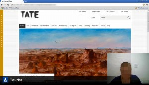
The homepage received positive feedback. The only drawback was that the size of the artwork displayed here was too big and made the rest of the content disappear below the fold on smaller screens. This resulted in us revisiting the design and making it clearer that users would need to scroll down the homepage to see more content.

Figure 2: “This is too big. I would look at that and think there is nothing on there.” (a participant)
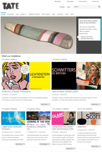
Most of the participants found the section landing pages easy to digest and visually pleasing, but there were some participants who struggled with some of the page layouts.
It’s a little bit confusing because the boxes are not the same size so that is quite difficult to look at. (a participant)
Oh, I missed it again! (a participant)
Overall the participants found the site easy to navigate, but some navigation mechanisms, second-level navigation and faceted navigation, suffered from being hidden or not intuitive and visually prominent enough. Upon discovering the faceted navigation, one of the participants commented, “It’s so easy it’s unbelievable.”
“I would say that’s better because you can see it straight away without the drop down because I wouldn’t notice those dropdowns up there.” (a participant)
In the first session, we tested two different designs for the faceted navigation, one with collapsed facets at the top of the page and the other with expanded filters on the left-hand side.
No idea what ‘Tate Etc.’ is. Probably click it out of curiosity. (a participant)
The user testing highlighted that the information architecture was easy to use and understand but would benefit from a few improvements as the research showed that some section labels were too ambiguous and required further investigation, which is still ongoing. In contrast, changing the section title from “Online collection” to “Art & artists” seemed to have been quite successful with our participants.
I’d like to go home now and have a read. (a participant)
It was close to impossible to test the content aspect on the prototype in the first session as the prototype consisted mainly of the section landing pages and allowed only for a very limited interaction with the content. In the second session, the participants were invited to explore the content in more detail. At that point, most were surprised by the amount of information the website had to offer.
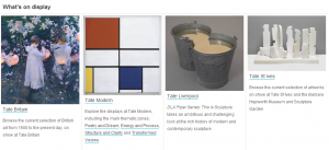
Nevertheless, participants sometimes struggled to find the information they were looking for and identified a few areas of content that needed to be made more obvious on the site. When asked to find out what was on display at one of the four Tate venues, to our big surprise, it was not clear to all participants that Tate, and by extension, the website, had access to many more works of art than were on display at any one time. Without this intuitive knowledge, users were unaware that they would need to filter down the full online collection to see what was on display in our galleries.

Figure 6: a direct result of this feedback was the creation of promotional content with links to the works on display at selected galleries dispersed across the website

Figure 7: artwork search results were redesigned to make it more prominent when an artwork is on display
The results presented in this case study are a small, but important, indication of the type of issues that might arise from usability testing sessions. No matter which methodology is applied, test your product with real users as early as feasible, as the usability testing carried out with your specific target audiences can yield invaluable feedback. An important thing to remember is not to expect the usability testing to solve all the problems around your digital product. It has got its limitations, some of which we have mentioned here, so do combine it with other research methods to continuously keep a close eye on your real users and their needs. The trickiest part is what happens after the interpretation of results: balancing recognised usability issues with business objectives and having the time and resources to act on these improvements. Through user-testing-based evaluation and analysis and through addressing the issues highlighted you will create a more highly usable digital product.
Acknowledgements
This paper was written to complement a How-to session at the Museums and the Web conference 2013 which provided hands-on opportunities to participants to plan for real user testing. Thanks to John Stack, Alex Pilcher, Liam Palmer, Emily Fildes, Maggie Hills, Fluent Interaction and all others who have contributed.
Reference
Nielsen, J. (2012, 10 September) “Traveling Usability Lab”, Nielsen Norman Group Blog. Consulted January 30, 2013. Available at http://www.nngroup.com/articles/traveling-usability-lab/
Further reading
Krug, S. (2010). Rocket surgery made easy: The do-it-yourself guide to finding and fixing usability problems. Berkeley, California: New Riders.
Mulder, S., and Z. Yaar (2007). The user is always right: A practical guide to creating and using personas for the Web. Berkeley, California: New Riders.
Cooper, A., R. Reimann, D. Cronin and A. Cooper (2007). About face 3: The essentials of interaction design. Indianapolis, Indiana: Wiley Pub.
Cite as:
T. Tasich and E. Villaespesa, Meeting the Real User: Evaluating the Usability of Tate’s Website. In Museums and the Web 2013, N. Proctor & R. Cherry (eds). Silver Spring, MD: Museums and the Web. Published January 31, 2013. Consulted .
https://mw2013.museumsandtheweb.com/paper/meeting-the-real-user-evaluating-the-usability-of-tates-website/


